


3
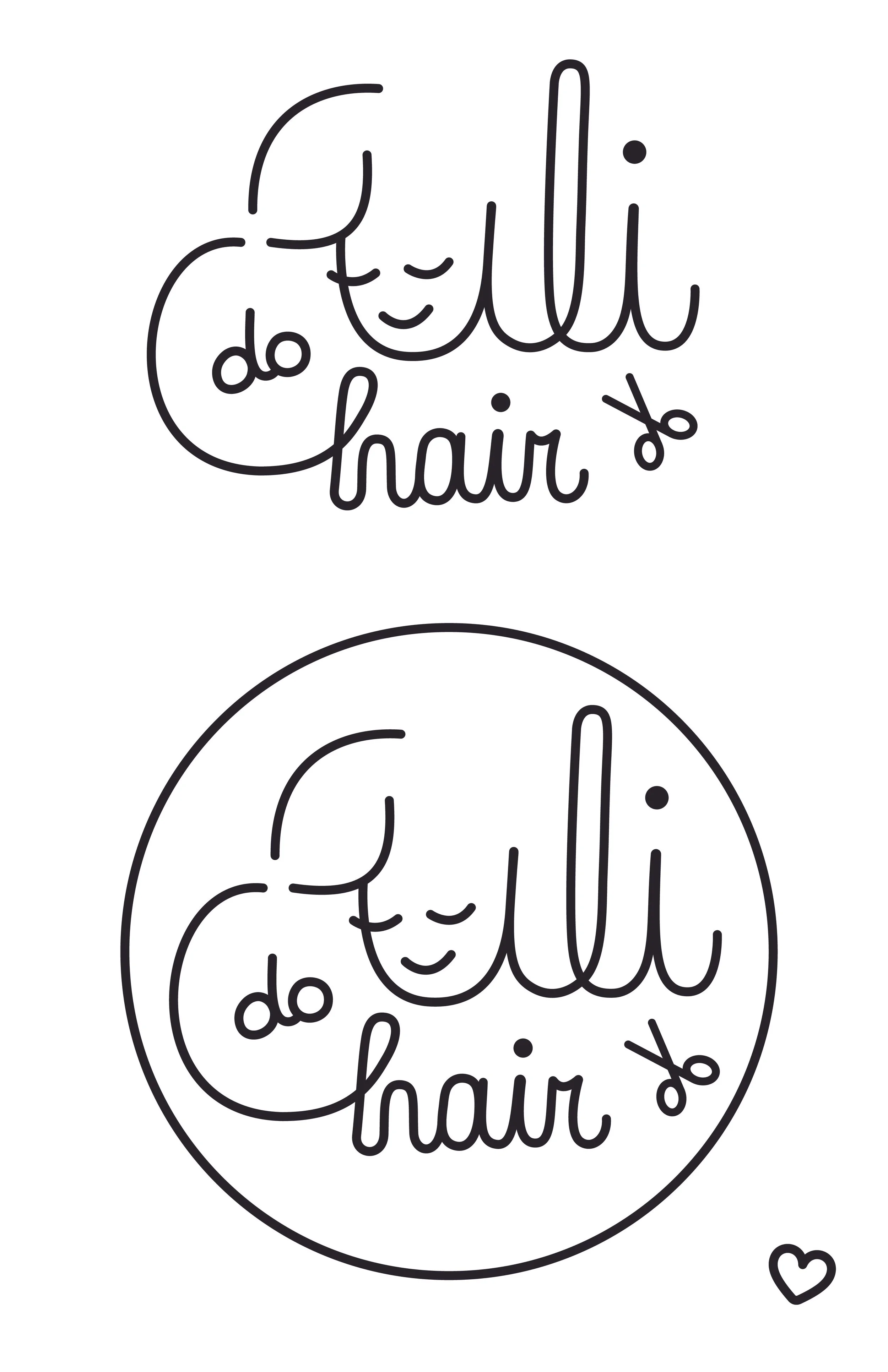
Uli Do Hair

1
Aveda Student Deal Flyer

5
Indy's

1
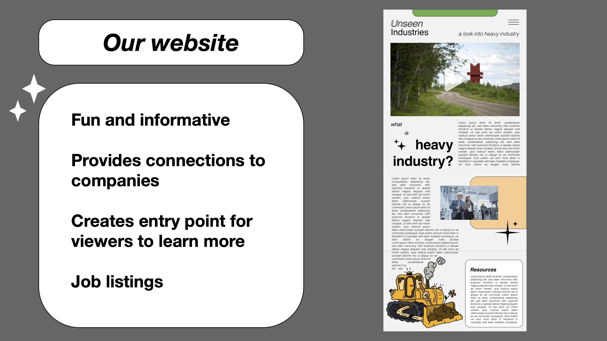
Unseen Industries Website Mockup

20
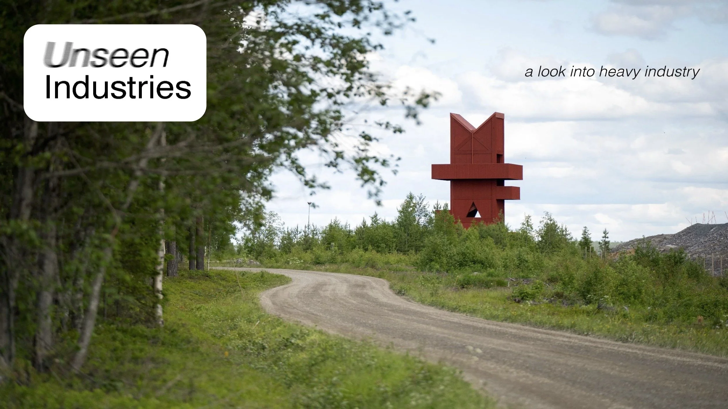
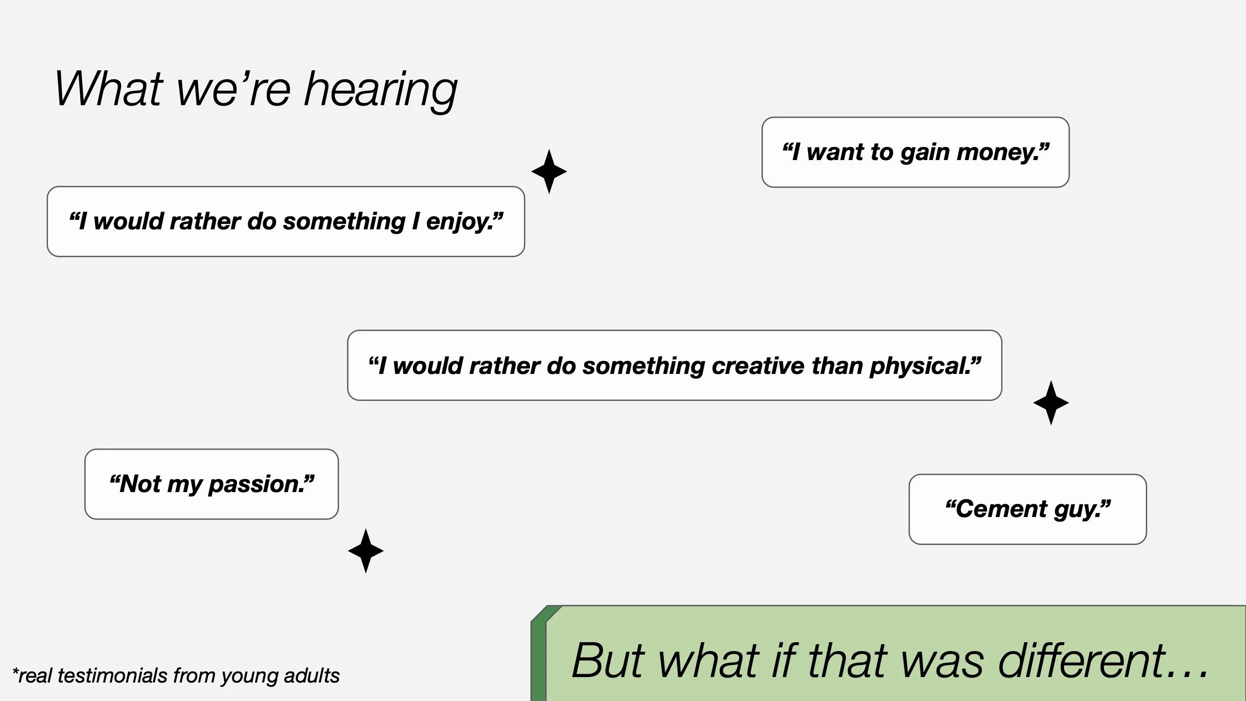
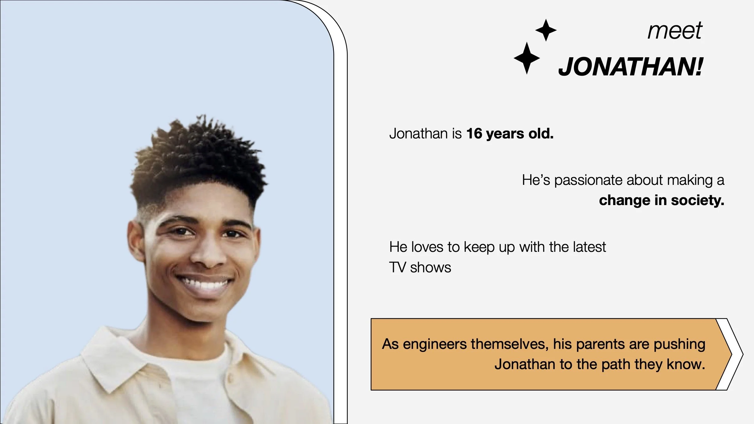
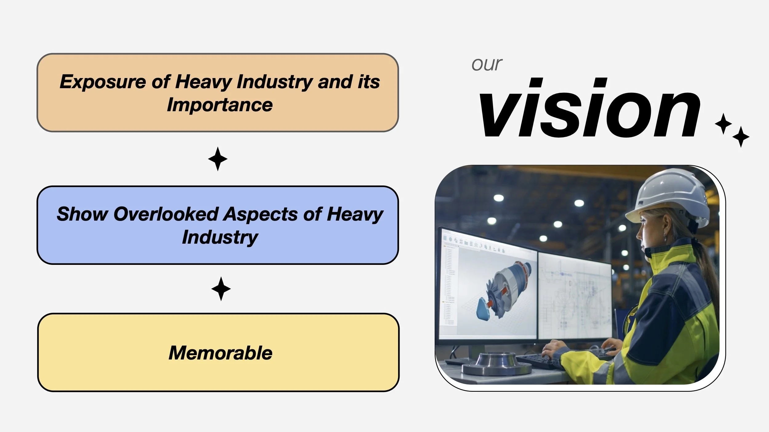
Unseen Industries Pitch Deck
7
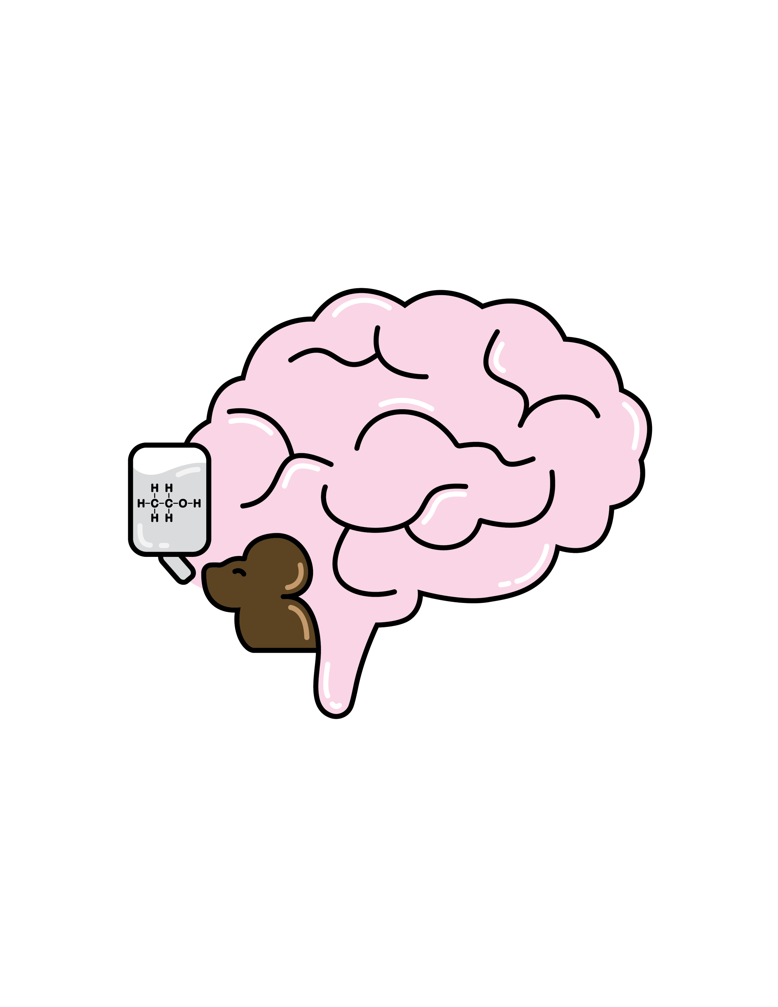
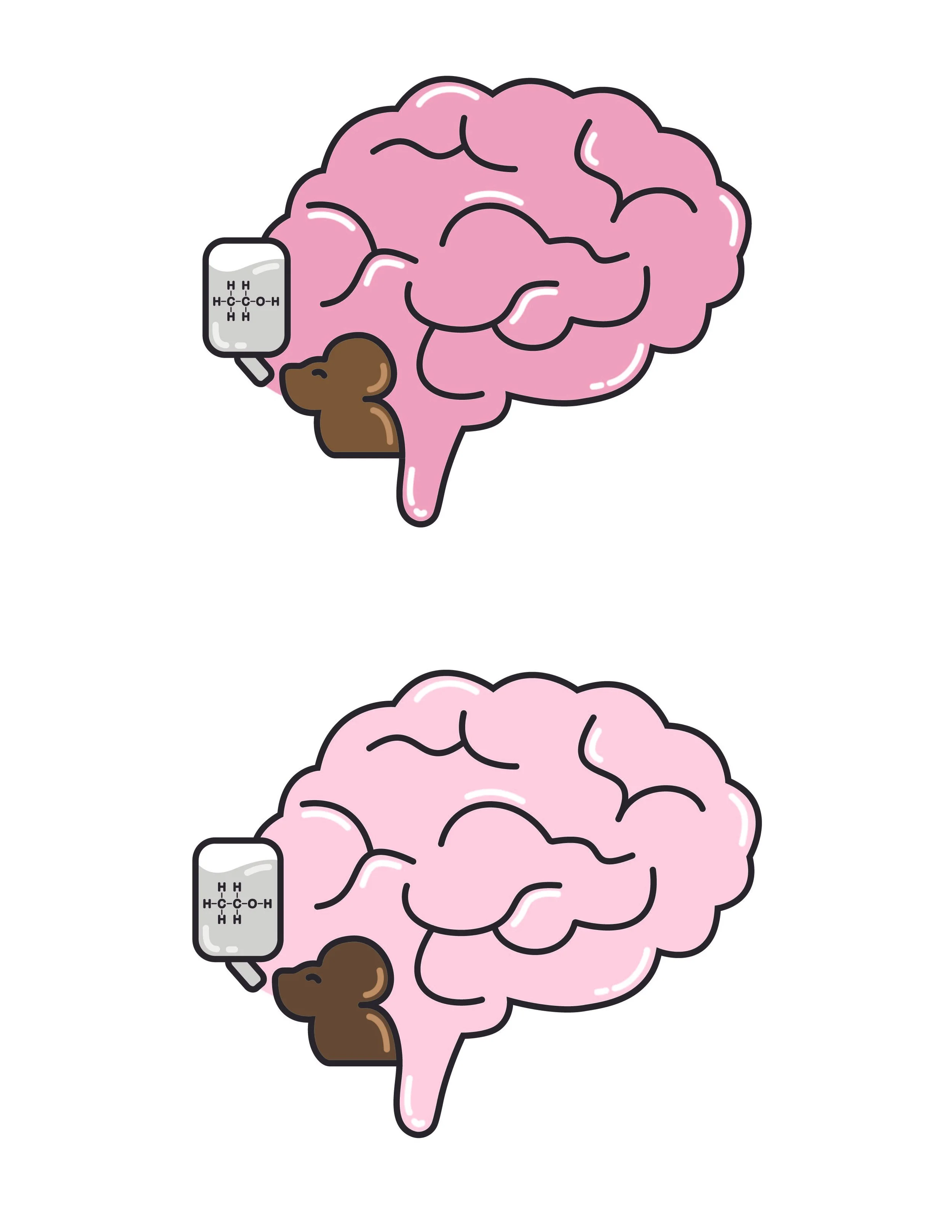
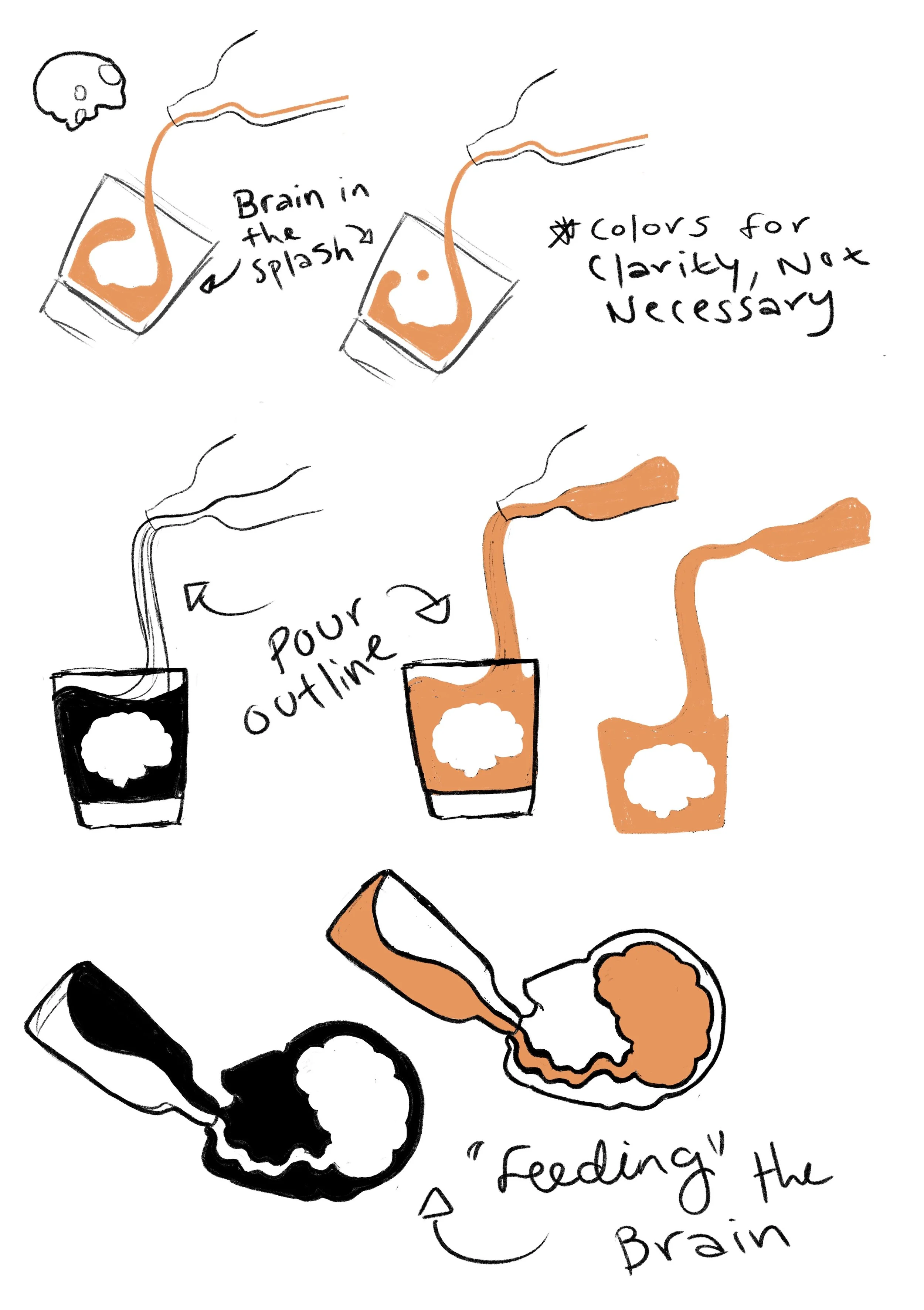
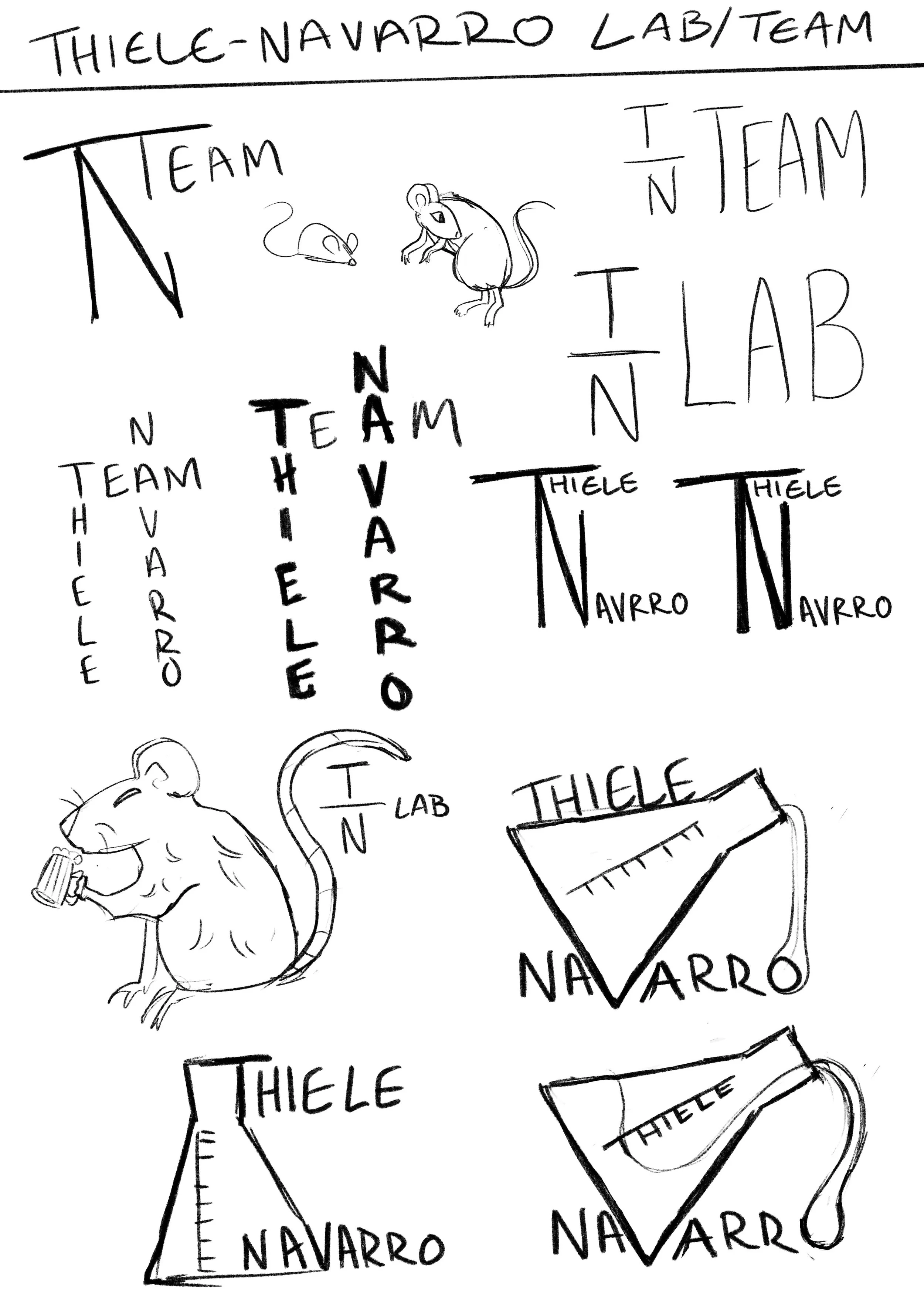
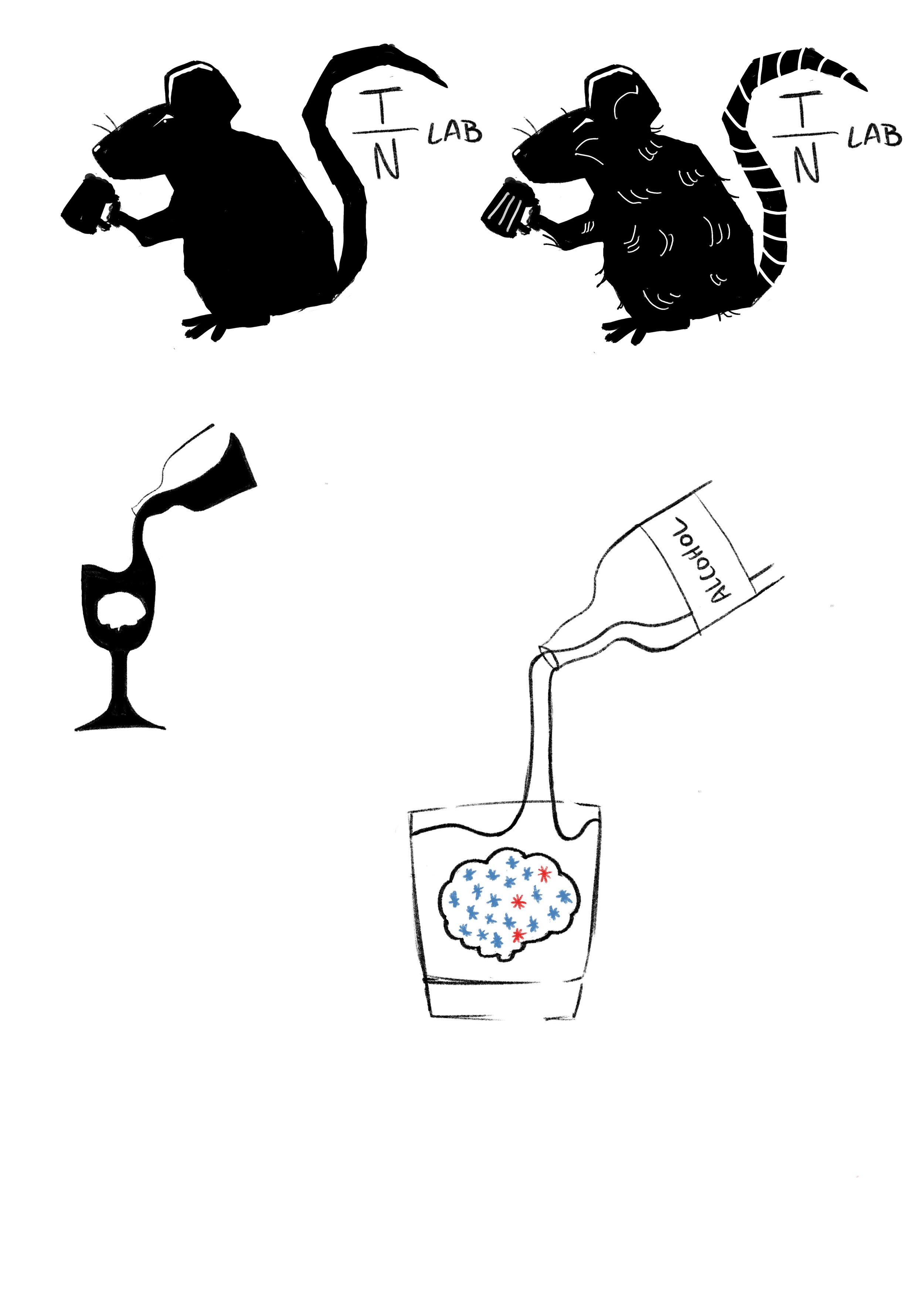
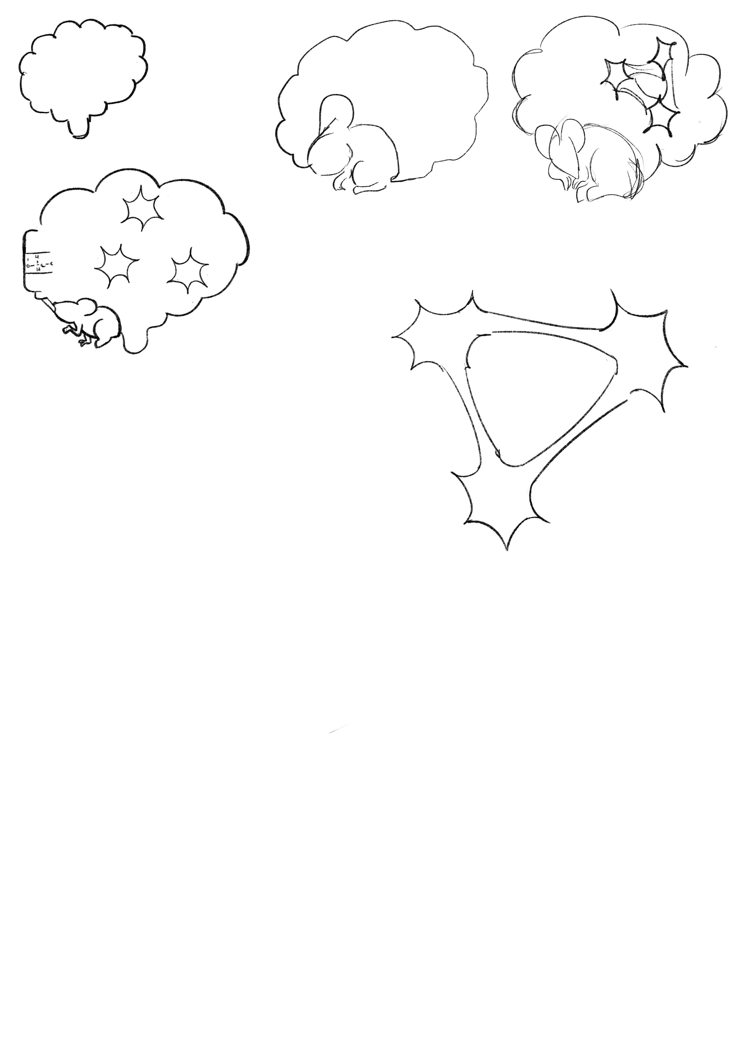
Lab Logo + Process Sketches

5
MILKLAB Pistachio Ice Cream + Revisions

5
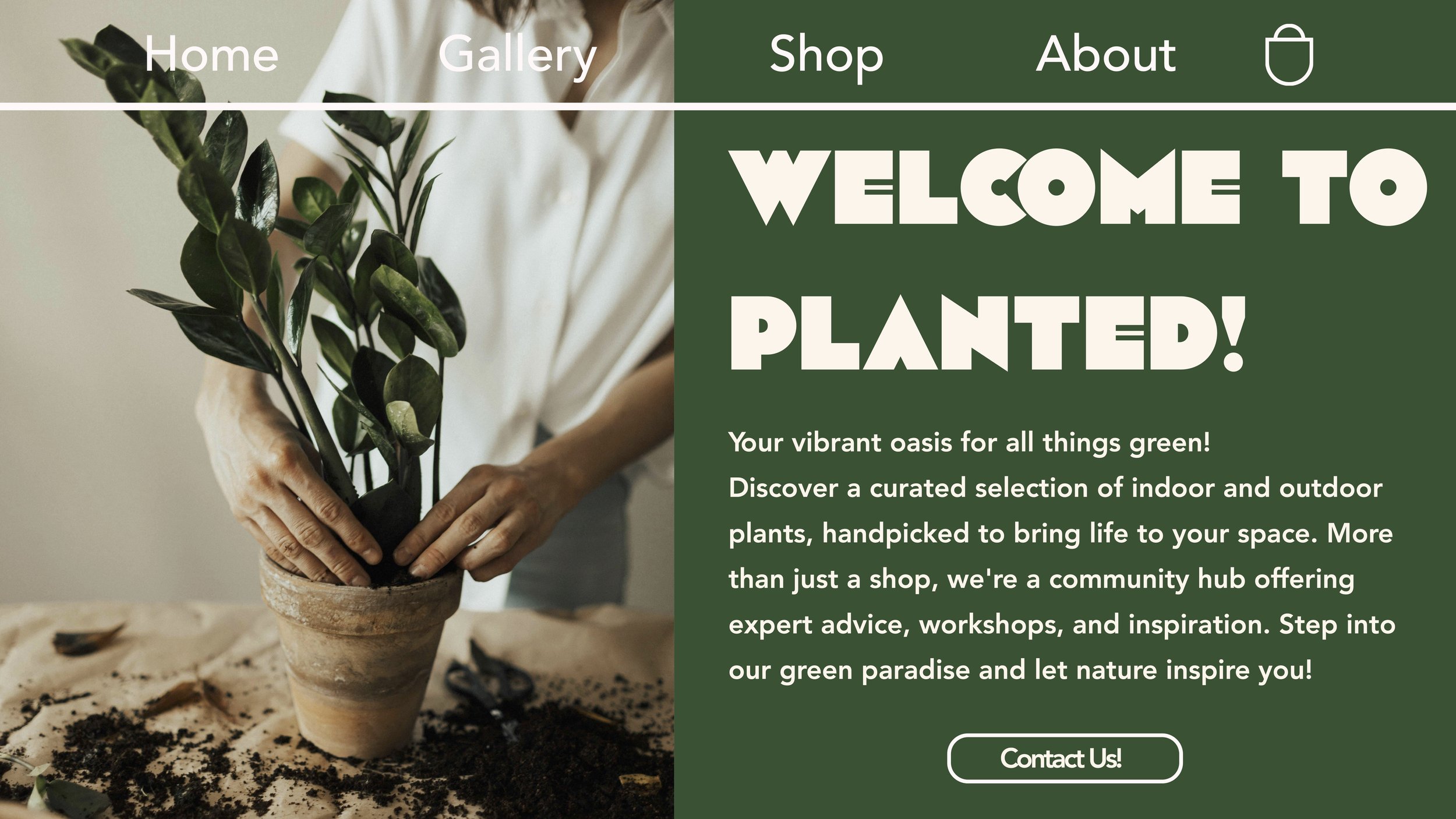
Planted!
1
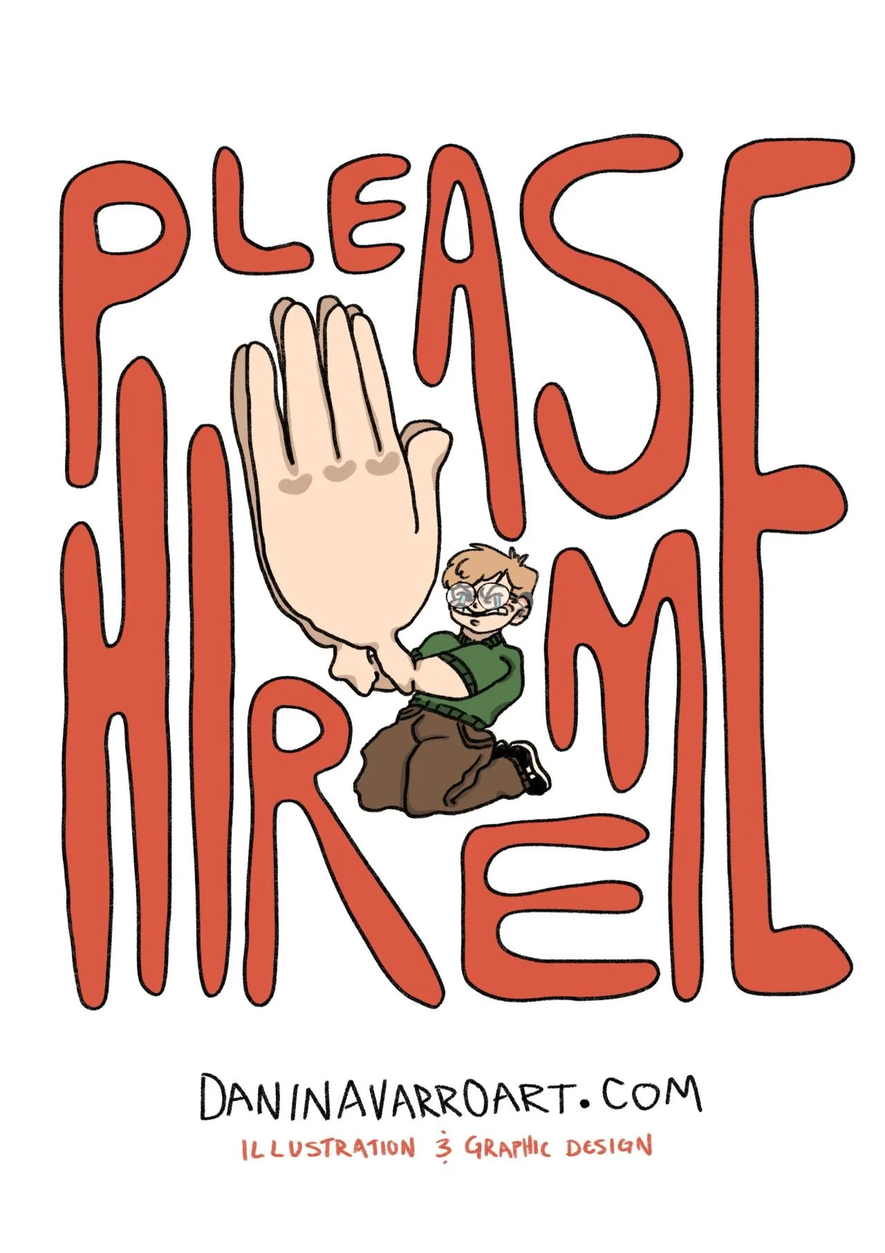
Please Hire Me

7
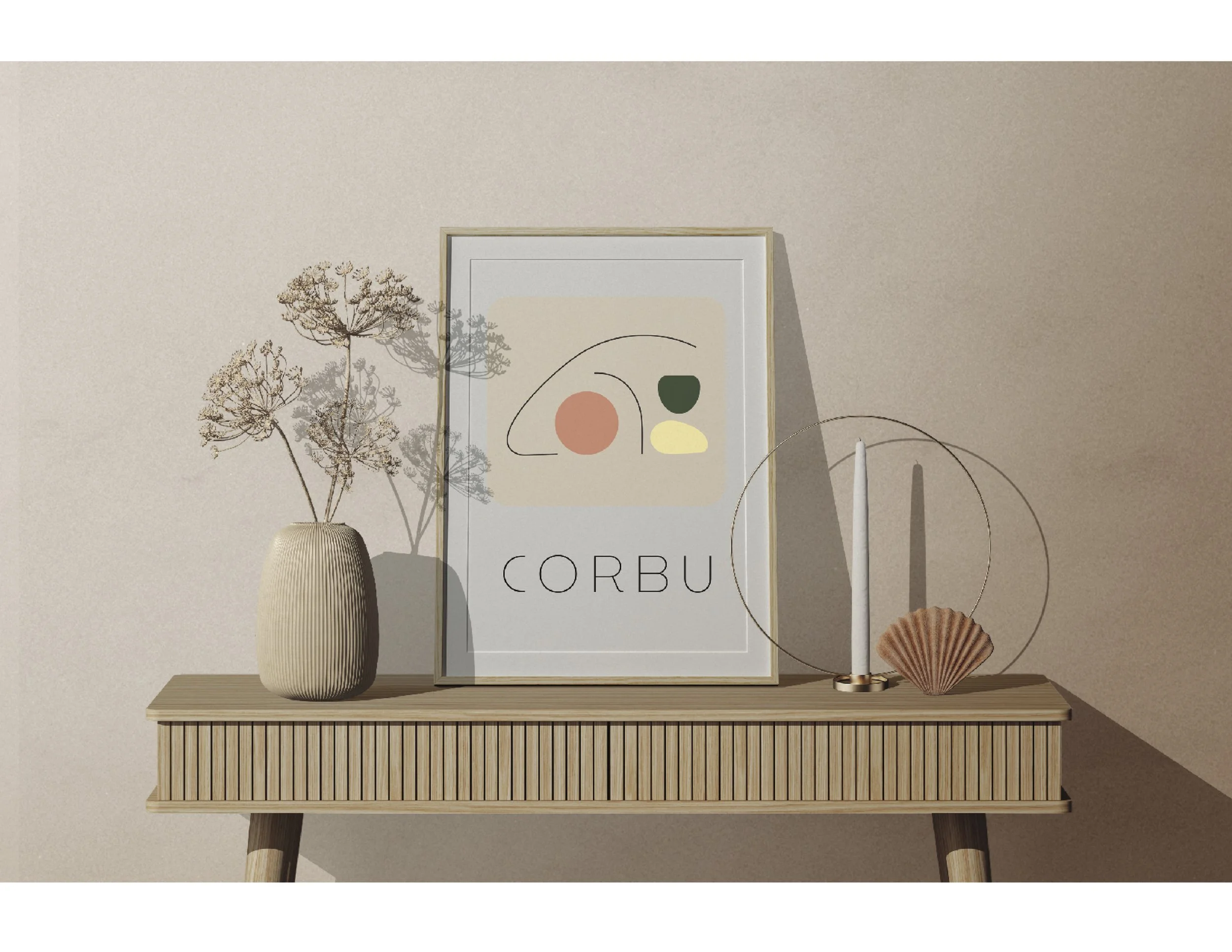
Corbu

1
Hey You!

7
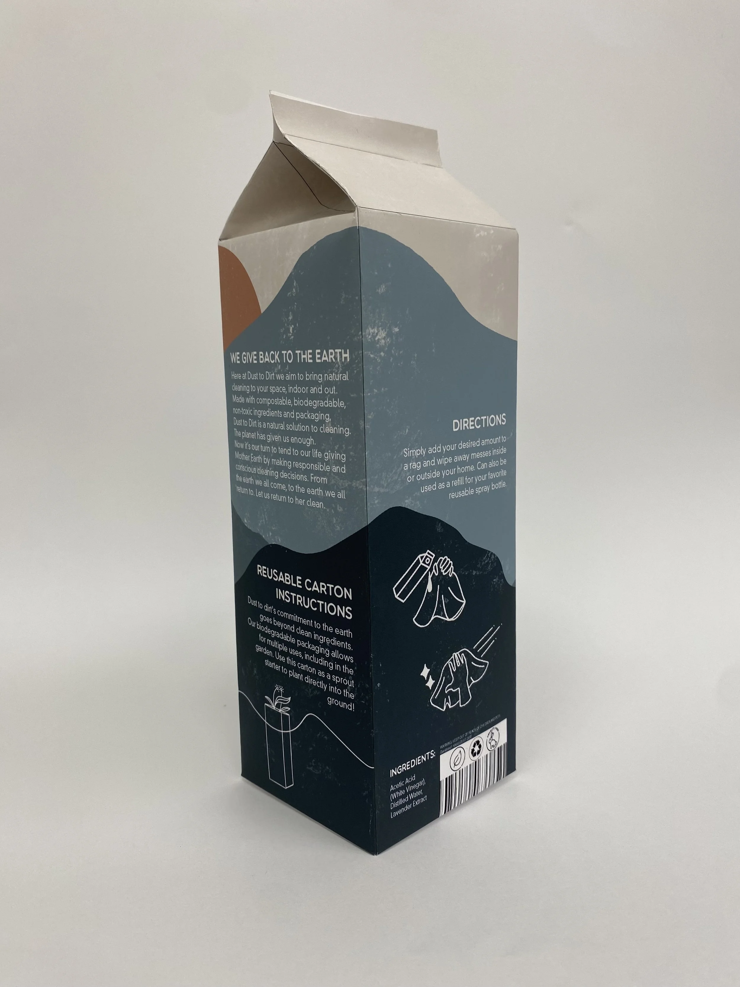
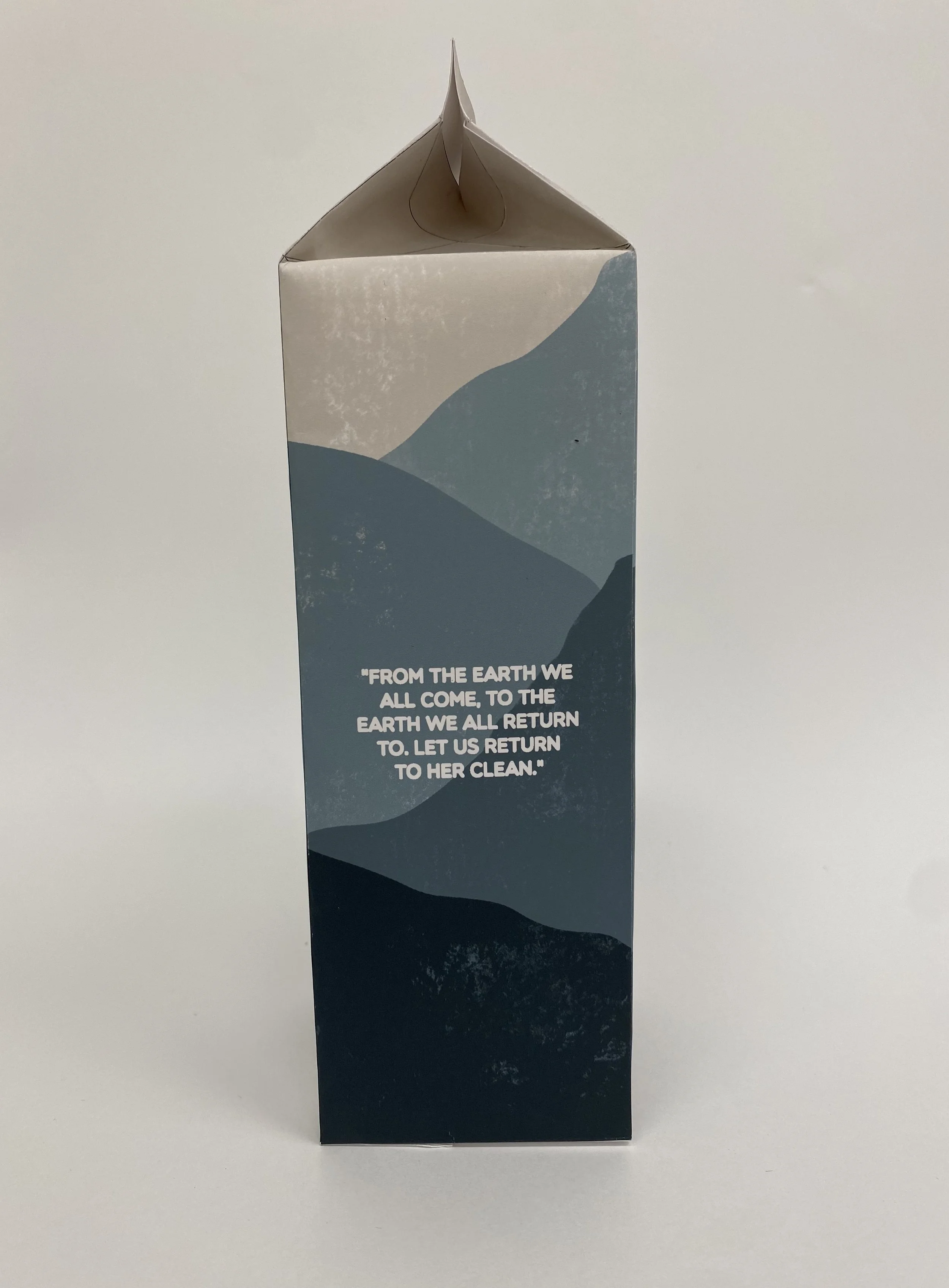
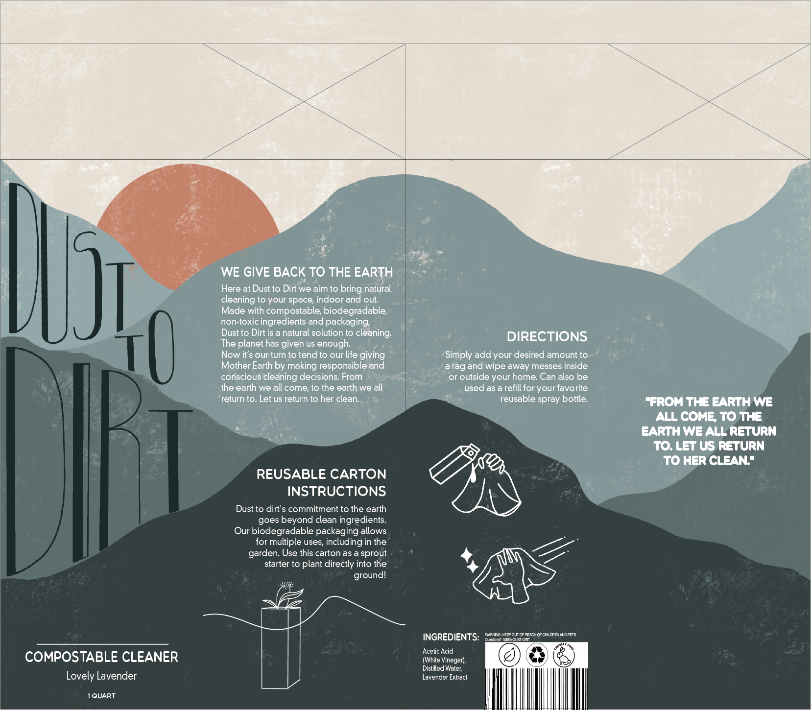
Dust to Dirt

4
Ode to Typography

3
Abode

3
Castles Made of Sand